OMD UK hosted an amazing Print Week last week. Dani and I were inspired by the sessions and we started to think about our favourite print adverts we have seen recently.
Print is often overlooked as a modern medium, but it breaks stories and sits in the hands of an engaged audience.
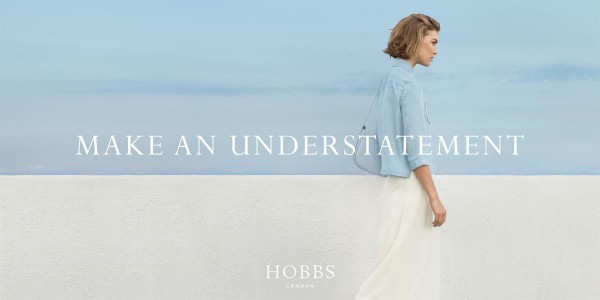
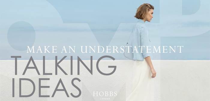
First up is Dani’s favourite Hobbs & Droga 5: Make an Understatement
I’m not prone to fawning over press ads, but this isn’t your average page polluter. The fact I stopped leafing through my copy of ES Magazine to admire it for at least seven seconds is remarkable in itself, but let’s not overlook how hard this campaign is working. First: the strategy. By championing blending in over standing out, Hobbs’ approach brazenly (and somewhat ironically) defies the traditions of the peacock fashion category. A neat fit, of course, for a British brand that’s more Kate Middleton than Moss.
Gap danced around a similar strategy in its ‘Dress Normal’ campaign, but the creative execution takes Hobbs further here. Elegant composition, sharp copy and washes of butter-soft colour tick a box a tutor of mine drew up in ad school — “make something so good-looking I’d want it on my wall” – and shows us what Hobbs is really saying: If you’re going to blend in, do it beautifully. Given that ‘Dress Normal’ failed to lift sales for Gap, this delivers the right amount of aspiration we’re apparently still after these days.
Shrinking violets aren’t invited and it’s the media placement that finally nails this sentiment. Amongst the cacophony of wordy articles and advert clutter, this is a masterfully located whisper. Hobbs, you have my attention.

Next up Rosie shines a spotlight on Snickers ‘Photo re-toucher’
It was really hard to pick a favourite print advert. I was torn between some of the really innovative adverts that are starting to emerge in the print category and more traditional storytelling. Brands are now using paper to tell stories in new ways with thanks to technology. Porsche recently created an ad that turned their car into a hologram. The category is changing.
However, what I think makes print brilliant is the ability to use context and storytelling to bring a platform to life. In media agencies, we create campaigns which cross channels . What I love about Snickers’ print advert is that it uses the same platform as their digital/TV/Social campaigns but it feels fresh. They have told the story in a way that is right for the medium. In the much-anticipated swimsuit issue of Sports Illustrated Snickers made fun of photo retouching. The context made the ad resonate and it got people talking about them as much as the models in minuscule bikinis. It was media and message at their best. Now I’m off to find a Snickers.


